Step-up to better pitchbook line charts
Understanding data before plotting it is the critical first step in chart creation, yet surprisingly I still come across charts where the underlying figures hadn’t been properly considered before pen was put to paper, so to speak.
Unfortunately, the valuable lesson of understanding data before charting it is usually only learned after a failed client presentation, when it has become apparent that the visualization didn’t work. And, while I definitely have a lot to say on this topic, I wanted to address a chart and data combination that I consider inexcusable.
Consider the below line chart that shows median target price for Campbell's Soup.
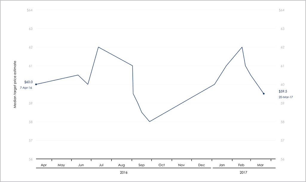
If you’ve ever created a similar chart, this may have been how you first charted the data, but then at some point, it’s likely you realized the chart should actually look like this:

What’s the difference?
The second chart recognizes the nature of the underlying data and the first doesn’t. There are two fundamental issues with showing median target price data as a line chart.
- Target price data is not continuous. That is on one day it is definitely one number and another day it is definitely another.
- Changes to median target price occur at irregular intervals (more so than changes to target price only).
A line chart just doesn’t work with these parameters. Because a line chart uses the shortest distance to connect two data points, the resulting chart is a series of misleading angled lines that inaccurately convey the data. Basically, if asked for the median target price for a specific date, unless it happened to be one of the days when it actually did change (which isn’t that often), your answer will be wrong. The line chart will indicate it to be some figure between two reported numbers when in reality, that figure was never an actual reported target price number. And if you can’t answer the simple question of what the median target price was for a particular date then it doesn’t say much about your chart.
A step chart, however, uses the combination of vertical and horizontal lines to connect data points in a series of step-like progressions, which is much better suited to irregularly reported data, and for any given day you can get a figure for the median target price.
And it’s not just median target data that shouldn’t be applied to a line chart; this also applies to ratings, earnings, share price, P/E ratio...basically anything with irregular reporting.
A step line chart may take a little longer to create in Excel, but it makes a big difference to the comprehension of your chart. In fact, it could well be the difference between a successful client meeting and, well, a not so successful one.
Have you had any issues charting data? Email me at adrian.s.crockett@gmail.com.