Compound charts: The visualization you’ve been waiting for
Data is everywhere, reporting on everything. Its abundance means more situations can be modeled, ideas explored, and numbers crunched to find answers to increasingly complex questions. But, as our data usage continues to evolve, so must our visualization techniques.
For the last 30 years or so, Excel has been the tool of choice for investment bankers, and by “of choice” read “only available”. While Excel has an array of powerful and intuitive visualization functions, it also has limitations.
One issue, in particular, is around the use of compound charts. Historically, when a question was answered with a visualization, it sat neatly within one chart. But the popularity of infographics illuminated how different chart elements can be combined to tell a more comprehensive story.
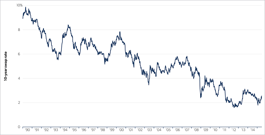
Say you wanted to talk to a client about interest rate swaps, the launching pad would probably be historical interest rates. A vanilla line chart such as the below may be used to drive home the point that interest rates are near historic lows.
But what if the sales point was more nuanced? Instead of just talking about the long or short rate, you wanted to talk more comprehensively? In this case, a compound chart—a visualization consisting of different, smaller elements that sit together within one visualization, would do the trick and be a more efficient use of page real estate, such as below:

So what exactly was done differently?
- Marginal histogram: While it uses the same underlying data as the standard time series line, the different visual treatment highlights additional data insights, such as distributional density.
- Donuts: Donut (or pie) charts are a simple way to annotate visually a particular takeaway. In the sample above, they sum up the proportion of the histograms that fall above the current level, helping the viewer assess if the current environment is unusual.
- Small multiples: While donuts and marginal histograms are supplemental to the line chart, repeating the chart across different data in identical panels extends the depth of the analysis. My favorite aspect of panel charts and small multiples is that you only need to explain the chart structure once.
Each of these individual components that coalesce into a compound chart could occupy a page by itself—and sometimes there may be cases where you want to do this—but most often, you will find a compound chart allows you to not only compress the number of pages in a pitchbook (something your client will thank you for), but also present a clearer story as all the data pieces connect toward a single message.
What are your thoughts on using compound charts in pitchbooks? Have you ever used an infographic with clients? Email me at adrian.s.crockett@gmail.com.